1. Nate Silver's been doubling down on this take recently (+ Comey just got the axe), so I think it's time to recap why I think he's so wrong
https://twitter.com/NateSilver538/status/862065731432849408
2. IMO, error attributing HRC's fall to 10/28 Comey letter comes down to:
a) math error
b) Nate covering for a previous statement about polls
3. Two days prior, Silver boldly claimed that those saying the race was tightening were cherrypicking:
https://twitter.com/NateSilver538/status/791403889451040768
4. In reality, the race was tightening, which should have been clear on 10/26, & was very clear 2-3 days later (before any post-Comey polls)
5. Nate not seeing this, IMO, provides a reason to try to attribute this to a later event, despite polling not really supporting his claim.
6. Now, the math. Silver takes raw polling from pollsters, then applies various adjustments to improve on them. e.g. his “polls+”
7. One problem’s that in this case, it doesn’t appear there’s strong reason to favor this approach. The final polls-only & polls+ projections:


8. Hindsight is 20/20 of course, but we now know who won. It’s hard to make the case that polls+, or other derivative measures, were better.
9. Silver actually acknowledged this during the 2016 election season, but is now relying on derivative data to make his Comey case.
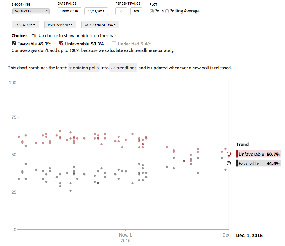
10. To derive “win probabilities”, 538 uses things like economic data, state polling, & also some “smoothing” algorithms for polling data.
11. The smoothing algorithm here, I believe, maybe part of the problem. Smoothing is like curve-fitting. Taking 1 value from noisy data points
12. A simple example is using a 5-day average of polling data, versus a 10-day average. There are advantages to both.
13. But, if you want to attribute influence to events occurring on single days, longer running averages make it harder to see that.
14. To analyze this event, I used raw data from realclearpolitics.com, with different chart customizations.
http://www.realclearpolitics.com/epolls/2016/president/us/general_election_trump_vs_clinton_vs_johnson_vs_stein-5952.html
15. Here is the polling for a 4-way race on 10/29, the first day w/ *any* post-Comey polling. HRC +2.6%

16. I looked at each poll in that day’s average, & calculated at most 2% of respondents could have read about the Comey Letter.
17. Using a very generous assumption, I believe the absolute largest HRC’s lead could have been *before* the letter is therefore 2.7%.
18. The polls closed on election day at HRC +3.3% (top right on previous graph). No indication her lead decreased after the letter.
19. Of course, before 11/8, there was also another FBI statement that nothing much was found. But, combining the 2 events is most applicable.
20. Where Silver & others go wrong, is that the polling averages would drop around 10/29 even w/o the Comey Letter. Why? 10/24 polls.
21. RealClearPolitics shows you all the polls in their average, and we see that on 10/24, HRC had several outstanding results.

22. But, after 5 days, those +14 and +9 polls drop out of the 5-day running average. A drop was imminent for that reason. Compare:

23. HRC at +3.8% on 10/28 becomes HRC +2.6% on 10/29. But, only 2% of respondents in 10/29 data could have heard about the letter.
24. This steep drop could not have been about the letter, and had almost everything to do w/ strong HRC polls leaving the average.
25. Looking at another metric, we have individual favorability polling data for both HRC & Trump. HRC before and after 10/29:


26. Again, we see in the favorability data a set of very good polls (for HRC) on 10/24.
27. Now, for Trump pre-Comey & post-Comey. This clear swing Silver sees is just in the noise:


28. Back to “smoothing”. Look at Trump’s favorability data before & after the *election*. A clear post-election bump, as per usual:
29. In statistics, sometimes it’s necessary to choose valid endpoints. In this case, the election (result) is a clear break in the data.
30. If you plot Trump’s number before & after the election, smoothed w/ one function, you see a gradual change:

31. The previous dataset, w/ heavy smoothing, shows Trump at -21.3% favorability on 10/29.

32. But, take the same dataset & end it on election day (left). Then, look at Trump’s net fav on 10/29 (right):

|

|
33. In the previous chart, you see Trump’s net favorability on 10/29 is -23.3%. A full 2pt difference just based on dataset endpoints!
34. So, by using heavy smoothing and data after the election, you can be tricked into seeing effects of the election way back on 10/29!
35. If you isolate the post-election data, use less smoothing, & work w/ the raw polling data, you see the “Comey effect” was mostly noise.
36. I feel a little uncomfortable criticizing Silver here, b/c he’s clearly advanced the state of the art in his field. But, this was bad
37. To be fair, I also had a prediction of my own to “defend”. I’ll let the reader decide who has more at stake, tho.

39. What you can see is a dip in stock prices immediately after the Comey letter. I suspect this may explain some of Nate's conclusion here.

40. However, just like the polling, we see that stock prices not only recovered after their post-Comey lows, but finished (11/8) above 10/28
41. But, that stock prices even translate into votes, & should be tracked *in addition to* polls, is highly speculative. Same w/ jobs rpt.
42. In short, I think Nate is too enamored w/ his unique methodology, & puts too much faith in its power; especially its news responsiveness
No comments:
Post a Comment